Website Source Case Study

Industry: Web Hosting
Site: http://www.websitesource.com
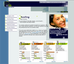
Description:Established a new brand for the award-winning website hosting company Website Source.
Client Quote
""It has been one of the best investments that I ever made in my company. I was hesitant at first because it is a lot of money, but now I realize it was not just an expense, but an investment that has really paid off!"
S. Rosendahl,
President/CEO,
Website Source, Inc.
Challenge
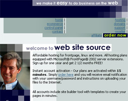
Website Source was already a success in a highly competitive market before approaching Ceonex with their request for a redesign. Yet certain challenges were limiting their growth. Those challenges included a site architecture that made navigation difficult, lack of a clear brand, and a conversion rate that could benefit from improvement.
Difficult navigation and poor usability
Visitors to the Website Source site were being confronted with a larger than usual amount of content. While appropriate and informative content is extremely helpful to creating an immersive user experience, many visitors were having difficulty finding the information they were looking for, or were otherwise getting lost while navigating the site.
Difficult navigation poses several problems. When a site does not guide a prospect to the order form, customer conversion will remain low. Prospects are not the only audience that may leave in frustration, however. Existing customers looking for specific information may encounter difficulty, potentially leading to greater turnover rates.

Lack of memorable brand
Given Lunarpages' extensive reputation as a web host of high regard, their old site failed miserably to communicate their professional image. The depth of their experience and professionalism was contrasted strongly with the shallowness of the site on multiple levels.
Bringing a professional image to the site would not only raise Lunarpages' esteem in the eyes of potential prospects, but also reinforce their value to existing customers. The creation of a congruent visual impression would then not only increase conversion rates but also retention rates.

Stagnated conversion rate
While Website Source enjoyed success in a highly competitive industry, they wanted the benefits of improved conversion rates. An increase in conversion rates would allow them to grow even further, by expanding their service offerings, upgrading their infrastructure and more. Website Source hoped to jump-start their conversion rates to allow this growth to occur.

