Berkshire Life Case Study
Industry: Disability Insurance
Site: http://www.berkshirelife.com
Description: Created Berkshire Life's online presence to forge a strong emotional connection with each of its target audiences, provide a user-friendly environment and drive key messages for one of the largest disability insurance providers in the nation.
Client Quote
"I'm confident in saying that, by executing Ceonex's plan, we have accomplished our goals... sales leads have more than doubled... In short, I would choose to entrust the production of any of our future web projects to Ceonex"
John Broderick,
Creative Director,
Berkshire Life
view letter
Challenge
The Berkshire Life project began with an assessment of their current site - a site that was, in fact, still using the original design. After reviewing the site, Ceonex found a number of vital concerns that needed to be addressed in the redesign project:
Outdated image
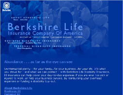
Berkshire Life's original site design was considered to be fairly sophisticated at the time of its release in 1998; by 2003, however, the look was quite dated and had fallen far behind in terms of utilizing recent and empowering Internet technology. A fresh new look was needed to present Berkshire Life as a current and healthy company.
Additionally, the original site was optimized for a resolution of 640 x 480. Today, this resolution currently accounts for only 1% of users*. Typically sites are now designed for the more common 800 x 600 resolution (47% of users) or higher.
* Source: http://www.dreamink.com/design5.shtml

Flawed usability
A site that is easily navigated carries the implication that the company is easy to work with, and that the experience of the customer is paramount. Unfortunately, Berkshire Life's original site had enough usability flaws to interfere with a positive user experience.
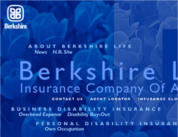
Among Ceonex's concerns was the poorly structured and inconsistent navigation. It was difficult to guess what on the page was "clickable," and the blue-on-blue text on the home page was hard on the eyes. The menu choices on the inner pages differed from section to section, making it too easy for the visitor to feel "lost."

Poor emotional impact
Insurance, and disability insurance in particular, is an uneasy subject for people, and therefore it is crucial for Berkshire Life to be able to provide an appropriate and positive emotional impact in all communications with clients and prospects. On the original site, the opportunity to make a warm and targeted connection on the home page was lost in favor of a cold blue landscape with distant flowers but no human presence.
While some inner pages featured small portraits of people, the choice of color for each main section was apparently made more with artistic value in mind than with a regard to the emotional backdrop each color provides. For example, the personal disability insurance section was a bold red, with potential negative connotations such as "danger," "stop" and "injury." Though Ceonex determined the color choices were not optimal, we decided the concept of color-coding sections was a valuable one and utilized it in the redesign.

Limited attention to customer conversion
To be maximally effective, a company's Internet site must focus on connecting with their prospects, converting them to customers, and then retaining them as long-term, satisfied clients. A web site provides more opportunity for interaction between prospect and company than other marketing tools such as brochures, advertising in print media or on television or radio, or through the use of mass mailings. Berkshire Life's original site, however, acted more as a brochure does - emphasizing the dissemination of information about the products rather than the opportunity to interact with, and convert, prospects.
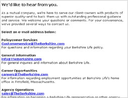
The links to contact Berkshire Life or find an agent were difficult to see on all pages, and each prompted pop-ups that directed the interested party to call the company or agent. This required prospects to be motivated enough to stop using the internet and pick up the telephone - rather than simply initiate contact from the web site itself. Berkshire Life's inquiry rate likely suffered as a result.

Ceonex's challenge was to update Berkshire Life's online presence in every way - and then to take the capabilities of the site even further, helping Berkshire Life to leap ahead of its competition.

